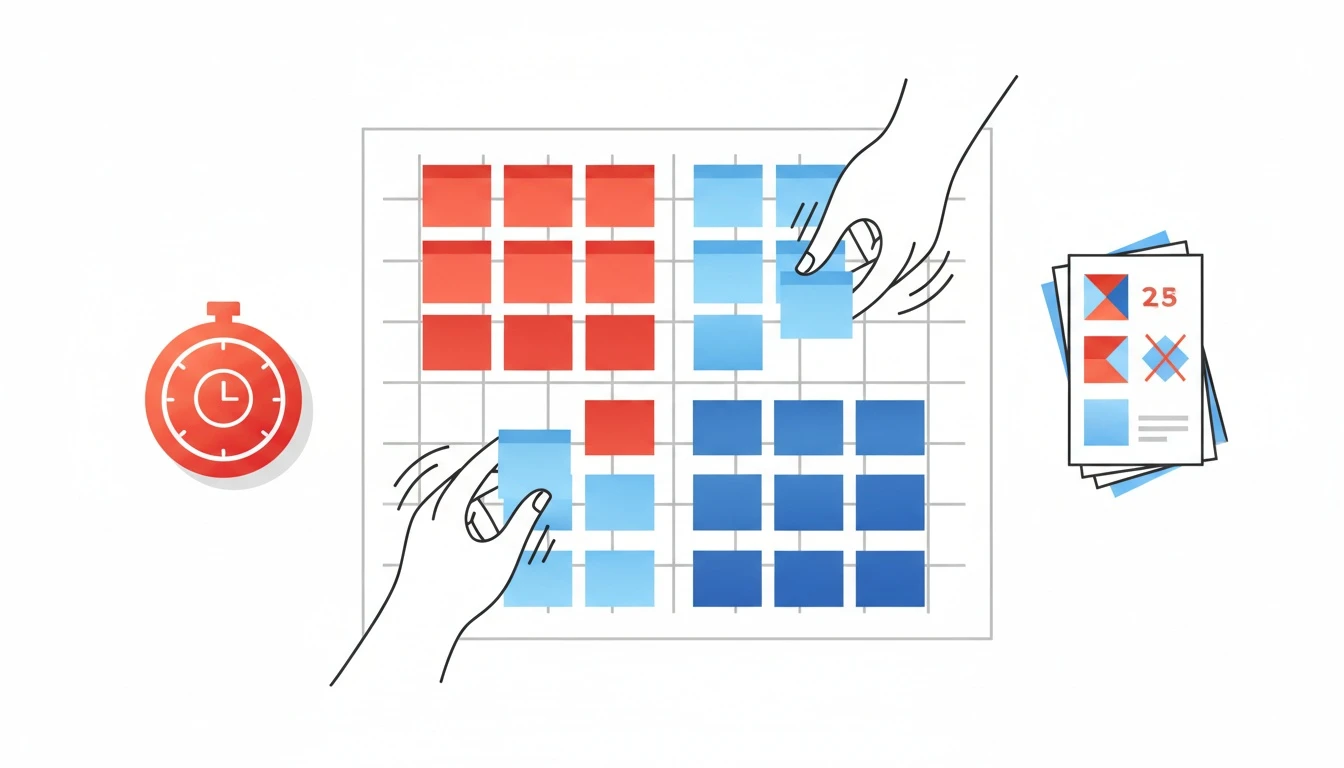
A decision flowchart is the fastest way to turn “we have too many ideas” into a ranked, defensible shortlist. Below is a concrete impact vs effort matrix example with 12 realistic initiatives, including the exact row data to capture, how to place items into quadrants, how to break ties with dependencies and risk, and how to produce a final decision summary you can ship to your team.
The 12-initiative impact vs effort matrix example (copy this)
I’m going to use a pattern we’ve used in quarterly planning with product and ops teams: Impact is a numeric proxy tied to a metric, effort is in hours, and we add confidence and risk so we do not “accidentally” prioritize polished guesses.
Impact score (1-10) in this example is anchored to one primary metric: expected quarterly lift in activation, retention, revenue, or cost-out. If your org needs a refresher on picking the right decision framework before scoring anything, start with Decision Frameworks: the complete guide as a baseline for aligning stakeholders.
ID
Initiative
Primary impact metric
Est. impact (1-10)
Effort (hrs)
Confidence (0-1)
Risk (1-5)
Opportunity cost note
Key dependencies
1
Fix onboarding drop-off at step 2
Activation rate
9
120
0.7
3
Blocks paid acquisition scaling
Design + analytics event audit
2
Self-serve cancellation flow
Support tickets, churn
6
40
0.8
2
Frees CS time for expansion
Billing provider API
3
Usage-based pricing experiment
Revenue per account
8
160
0.5
4
Could distract GTM for 6 weeks
Finance + legal review
4
Reduce cloud spend via reserved capacity
Gross margin
7
60
0.9
2
Immediate savings fund roadmap
Infra access + baseline reports
5
Add SSO for enterprise
Sales cycle time
7
200
0.6
3
Unblocks 2 enterprise deals
Security review
6
Improve search relevance
Time-to-value
8
140
0.6
3
Reduces churn drivers
Data quality cleanup
7
Weekly executive metrics dashboard
Decision latency
5
30
0.9
1
Prevents misalignment churn
Source of truth definitions
8
Refactor monolith module X
Dev velocity, incidents
6
220
0.7
4
Avoids compounding outages
Senior eng availability
9
Add in-app “what’s new”
Feature adoption
4
25
0.7
1
Helps adoption but not core KPI
Copy + release process
10
Automate invoice reminders
DSO, collections
5
35
0.8
2
Reduces manual ops overhead
Email deliverability
11
Improve NPS survey targeting
Response quality
3
20
0.9
1
Low upside, but cheap
Event triggers
12
“Dark mode” UI
Qualitative satisfaction
2
90
0.6
1
High distraction risk
Design bandwidth
If you want the matrix to behave like a decision making matrix instead of a brainstorming wall, calculate one derived number: Confidence-adjusted impact = Impact x Confidence. It is simple, explainable, and it stops the “big bet with no evidence” problem early.
Standalone rule worth quoting in planning docs: If you cannot name the metric the initiative moves, you do not have an impact score yet.
What data do you need for each initiative row?
Impact vs effort matrices fail when the rows are vague. The fix is a strict row schema. Every initiative needs enough data for a consistent decision logic path, even when the room gets political.
Here’s the row schema I use, and why it matters:
One primary impact metric (not five). If you list activation, retention, revenue, and NPS, you will argue about which one “counts” after the scoring. Pick one, then document secondary effects in notes.
Impact estimate with an anchor. “8/10” should mean something. I typically anchor 10/10 to a top-quartile outcome for that quarter (example: +5% absolute activation lift, or -15% support tickets). The exact anchor changes by company size and baseline.
Effort in hours, not T-shirt sizes. Hours are imperfect but comparable. If you need a quick calibration, use a two-number estimate (optimistic, pessimistic) and average it.
Confidence (0 to 1). Confidence is your “evidence multiplier.” A 9 impact with 0.4 confidence is not the same as a 7 impact with 0.9 confidence.
Risk (1 to 5) with a label. Risk is not “hard.” Risk is: security, reliability, compliance, brand, or revenue risk. This is where you capture modifiable risk factors like unclear requirements, missing analytics, or unknown API limits.
Opportunity cost note. This is the sentence that prevents stealth roadmap swaps: “If we do this, we cannot do X.”
Dependencies and sequencing. If initiative 6 requires data cleanup, record it. If initiative 5 requires security review lead time, record it.
When teams ask me why this feels “heavy,” I point to the alternative: a quarter of work that cannot be defended when the numbers miss. If you want a deeper guide to selecting the right structure for your org (RICE vs ICE vs matrices vs decision trees), how to choose a decision framework for your team is the quickest alignment read.
External reference that’s useful when debating “what is a matrix good for”: Wikipedia’s overview of decision trees is a clean way to explain why a matrix is a simplification, not a full decision flowchart.
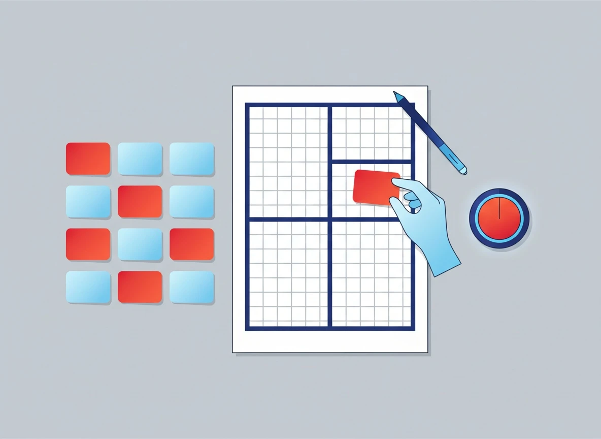
How do you place items in the four quadrants?
Impact vs effort matrix placement needs thresholds, otherwise every sticky note ends up “high impact, low effort” in someone’s head.
Step 1: Set explicit thresholds (do this before scoring)
For this example:
High impact = 7-10
Low impact = 1-6
Low effort = 0-80 hours
High effort = 81+ hours
You can tune these, but lock them before you place anything.
Step 2: Place all 12 initiatives
Quadrant
Definition
Initiatives from the example
What you usually do with them
Quick wins
High impact, low effort
4 (reserved capacity), 1 is borderline if you can slice scope
Notice something important: refactors are often mislabeled as time sinks because the impact is indirect. If module X refactor reduces incidents by 30% and frees 20% engineering time, it might be a major project. Force the metric.
External benchmark worth using in planning discussions: Google’s guidance on measuring and improving performance shows why “invisible” work can have real KPI impact when it reduces latency and failures (Google Search Central on performance). Even if you are not doing SEO, the principle holds: performance work is measurable.
How do you handle tied scores and dependencies?
This is where most matrices stall. Two initiatives land in the same quadrant, with similar scores, and the team goes in circles.
I use a tie-breaker stack that behaves like a decision matrix example you can defend in a doc.
Tie-breaker 1: Confidence-adjusted impact per hour
Compute:
Adjusted impact = Impact x Confidence
Value density = Adjusted impact / Effort hours
You do not need perfect math. You need consistent math.
Here are a few from the table:
Initiative
Impact x Confidence
Effort (hrs)
Value density
4 Reserved capacity
7 x 0.9 = 6.3
60
0.105
2 Cancellation flow
6 x 0.8 = 4.8
40
0.120
7 Exec dashboard
5 x 0.9 = 4.5
30
0.150
1 Onboarding step 2
9 x 0.7 = 6.3
120
0.053
5 SSO
7 x 0.6 = 4.2
200
0.021
This is why dashboards sometimes win early: they are dense, low-risk, and unblock better decisions. That does not mean you build dashboards forever. It means you earn the right to place bigger bets with better data.
Tie-breaker 2: Dependency sequencing (the hidden decision flowchart)
Dependencies create a real decision flowchart even if you do not draw it. Example: if onboarding fixes require an event audit, then the audit is not “overhead,” it is part of the initiative. Fold it into effort or split the initiative into sequenced slices.
Sequencing rule I use: If an initiative is a prerequisite for two others, treat it like a platform investment and pull it forward.
Tie-breaker 3: Risk and opportunity cost
If two items are tied on value density, pick the one with:
Lower opportunity cost (does not stall a team’s main roadmap)
Better reversibility (you can roll back safely)
This is also where teams should be honest about the pros and cons of AI in planning. AI can speed estimation and scenario analysis, but it can also create false certainty. A good matrix makes uncertainty explicit via confidence and risk.
If you need a template to standardize your tie-breakers, treat the row schema + thresholds + tie-breakers as your living decision matrix template. Teams that write this down once stop re-litigating it every quarter.
What does a final decision summary look like?
A matrix is not the deliverable. The deliverable is a shortlist with sequencing, owners, and “why.” Here’s what a clean summary looks like after applying the tie-breakers and dependencies.
Example quarterly shortlist (what I would ship)
Priority
Initiative
Why it made the cut
Cut line notes
P0
4 Reduce cloud spend
High confidence savings, low risk, funds roadmap
Do in first 2 weeks
P0
7 Exec metrics dashboard
Fast clarity, improves future scoring accuracy
Lock metric definitions
P1
2 Self-serve cancellation
Medium impact, strong value density, reduces support load
Ship behind feature flag
P1
1 Onboarding drop-off fix (scoped)
Highest KPI upside; split into audit + one step fix
Do not boil the ocean
P2
6 Search relevance (phase 1)
Strong upside, but dependency on data cleanup
Phase gates required
P2
10 Invoice reminders
Clean ops win, low effort
Bundle with billing work
And here’s what gets explicitly deprioritized:
12 Dark mode: not tied to a core metric this quarter.
5 SSO: only if enterprise deals are truly committed and resourced.
3 Pricing experiment: too risky without baseline instrumentation and a rollback plan.
8 Refactor module X: only pulled in if incidents are already a top-3 churn driver.
That is a real shortlist. It has tradeoffs, and it tells the truth about sequencing.
Convert the matrix into an AI-generated options map (so it stays updated)
This is the part most teams miss: estimates change mid-quarter. If your plan is a static spreadsheet, your decision logic drifts and you end up with inconsistent choices.
In Lucid, we take the same 12 initiatives and generate an options board: each initiative becomes an option card with pros, cons, and future consequences. When effort hours change, the board updates the quadrant placement and re-ranks the shortlist consistently, instead of forcing you to redo the entire doc.
This is where the “metrics vs matrix” confusion disappears. The metric stays the anchor, the matrix is the visualization, and the options map is the living decision record.
People ask for “pros cons artificial intelligence” lists, but in planning the real question is: does AI reduce decision latency without hiding uncertainty?
Where AI helps in quarterly planning
Where AI hurts (if unmanaged)
Drafting consistent pros/cons across initiatives
Overconfident narratives that outrun evidence
Scenario analysis when effort or scope shifts
Hallucinated assumptions about metrics or dependencies
Keeping a living decision log as context changes
Team stops doing real discovery because “AI decided”
If you need the broader framing, artificial intelligence pros and cons is a neutral reference you can link in internal docs, but your matrix should still carry confidence, risk, and dependency truth.
Frequently Asked Questions
What are the pros and cons of AI for prioritization?
AI is great at turning messy notes into structured options, surfacing missing constraints, and keeping a decision record consistent as inputs change. It is risky when teams treat generated outputs as facts, so keep confidence scores and require metric anchors for every impact claim.
What are the 5 pros and 5 cons of AI?
Pros: speed, summarization, scenario generation, consistency, and searchable decision logs. Cons: false certainty, hidden assumptions, data leakage risk, bias from training data, and over-reliance that replaces discovery.
What is a decision making matrix vs an impact vs effort matrix?
An impact vs effort matrix is a specific decision making matrix that compares initiatives on two axes. A broader decision making matrix can include more criteria (risk, confidence, cost, compliance) and often produces a numeric ranking, not just quadrant placement.
How do you handle dependencies in an impact vs effort matrix?
Treat dependencies as part of the initiative’s effort or split the initiative into sequenced slices that can be scored independently. If one prerequisite unlocks multiple high-impact items, prioritize it like a platform investment.
Next step: turn your 12-row matrix into a living decision board
Open your quarterly planning doc and rewrite each initiative into the row schema above: one metric, impact score, effort hours, confidence, risk, opportunity cost, dependencies. Then calculate confidence-adjusted impact per hour and draw a clear cut line.
When you’re ready to stop redoing the matrix every time estimates change, build the same shortlist as a Lucid options board so pros/cons and future consequences update automatically as your inputs evolve. Start with a single planning session and capture the decision record once: create your Lucid decision board.
Impact vs Effort Matrix Example: 12 Initiatives | Lucid