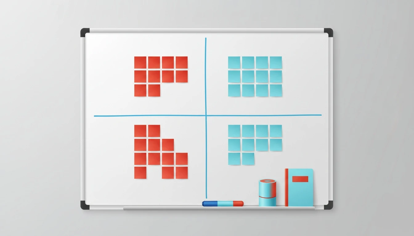
An impact vs effort matrix is a fast, reliable way to prioritize initiatives by sorting them into a 2x2 grid: high impact/low effort (do now), high impact/high effort (plan), low impact/low effort (fill), and low impact/low effort (avoid). This guide gives you a scoring system your team can reuse, a session format that avoids politics, and a way to keep consequences and assumptions visible as things change.
What is an impact vs effort matrix and what does it optimize for?
The impact vs effort matrix optimizes for one thing: getting to an execution-ready priority order with imperfect information. It is not a truth machine. It is a decision aid that makes tradeoffs explicit so a team can commit without spending two weeks “aligning.”
If you have ever watched a roadmap meeting derail into opinion warfare, you already know the real problem: teams argue about different definitions of impact, different effort baselines, and different risk tolerance. The matrix forces those into the open.
A useful mental model is to treat the matrix as a lightweight decision making matrix: you are ranking options against two high-signal criteria that correlate strongly with outcomes. That simplicity is why it works in product, ops, and growth. It gives you a shared language for “quick wins” vs “big bets” without needing a 30-column spreadsheet.
Here is the practical meaning of each quadrant:
Quadrant
What it really means
Typical action
High impact, low effort
Strong expected value with low time cost
Pull into the next cycle
High impact, high effort
Big upside but requires sequencing and capacity
Break down, validate, then schedule
Low impact, low effort
Small wins, often hygiene
Batch if it supports bigger goals
Low impact, high effort
Value does not justify cost
Kill, defer, or redesign
One sentence I repeat in sessions: “We are not choosing what is best. We are choosing what is best given our constraints.” That is decision theory in plain English.
How do you define impact and effort so scores are comparable?
Impact vs effort matrices fail when impact is a vibe and effort is a guess. You need definitions that survive cross-functional scrutiny and can be reused next month.
Define “impact” as a measurable delta, not a narrative
Impact is the expected change in a business outcome if the initiative ships. Pick 1 primary outcome metric and 1 secondary. If you pick five, you will justify anything.
For product and growth, impact usually maps to revenue, activation, retention, or margin. For ops, it is often cycle time, error rate, compliance risk, or cost to serve. The key is to express impact as a delta with a time window.
A workable impact rubric I have used across SaaS teams:
5 = Step change: likely moves the primary metric by 10%+ within one quarter.
3 = Meaningful: likely moves it by 3-10% within one quarter.
1 = Marginal: likely moves it by <3% or takes longer than a quarter.
This is not perfect, but it is comparable. If you need a sanity check on “what counts as meaningful,” use your own baseline variance. If your weekly conversion rate naturally swings 2%, then a projected 1% lift is not impact, it is noise. That’s the same logic behind analysis of variance in statistics: separate real signal from random fluctuation. Wikipedia’s overview of analysis of variance (ANOVA) is a good refresher if your team needs the intuition.
Define “effort” as total cost, not just build time
Effort is not “engineering weeks.” Effort is the total organizational cost to get the outcome, including coordination overhead and risk.
A simple effort rubric that stays honest:
Effort score
Total time cost (end-to-end)
What it usually includes
1
0.5 to 2 days
single owner, no dependencies
2
3 to 7 days
minor review, limited QA
3
2 to 4 weeks
cross-functional coordination
4
1 to 2 months
multiple teams, rollout plan
5
1 quarter+
platform work, heavy change mgmt
Notice the phrase “end-to-end.” It includes design, QA, analytics, rollout, training, and support.
Add the two modifiers that stop bad bets early: confidence and dependencies
Impact and effort alone hide two killers: you might be wrong (low confidence), or you might be blocked (dependencies).
I like a lightweight “ICE-style” adjustment without turning the matrix into a PhD thesis:
Confidence (0.5x to 1.2x): based on evidence quality (experiment data beats anecdotes).
Dependency penalty (+1 effort or -1 impact): if you need another team, a vendor, legal, or a migration.
This is also where opportunity cost belongs. If a big bet consumes your best team for 8 weeks, the opportunity cost is everything else they cannot do. Make it explicit.
If you want a reusable worksheet, treat this as a decision matrix template: a table with columns for Impact, Effort, Confidence, Dependencies, Risk, and Notes. The grid is just the visualization layer.
How do you run a team session without politics?
The goal of the session is not consensus. It is clarity. Consensus is slow and often fake.
I have run these sessions with product, ops, growth, finance, and exec stakeholders in the room. The pattern that works is to separate private scoring from group discussion, and force evidence before opinion.
Here is the step-by-step flow (order matters):
Pre-work (async): share the initiative list with one-paragraph briefs and a baseline effort guess. Ask each participant to privately score impact and effort.
Align definitions (10 minutes): restate the impact and effort rubrics. Lock them. No mid-session rubric edits.
Silent placement (10 minutes): each initiative gets placed on the grid based on median scores. No debate yet.
Resolve only the outliers (30-45 minutes): discuss items where scores diverge by 2+ points. Require a reason and evidence.
Commit to next actions (10 minutes): each quadrant gets an explicit action: ship, decompose, batch, or kill.
Two rules that keep politics down:
The person with the strongest opinion must bring the strongest evidence. If you cannot point to data, user research, pipeline numbers, or incident history, you are arguing vibes.
Disagreement is a signal to run scenario analysis, not to argue longer. When impact is uncertain, treat it as a range and plan a validation step.
If you need a tie-breaker, use a risk lens. A risk control matrix mindset helps: what risks are we reducing, accepting, transferring, or avoiding? (This comes from risk management practice, not product folklore.) For a solid grounding, the National Institute of Standards and Technology has clear framing on risk and controls in NIST SP 800-30 risk assessment guidance.
One more practical trick: when people start lobbying, switch the view. Ask, “What would change your score by one point?” That question turns politics into falsifiable assumptions.
How do you turn the matrix into an options board with consequences?
An impact vs effort grid is a snapshot. Your real problem is that inputs change: effort estimates get revised, dependencies appear, confidence drops, and suddenly last month’s “quick win” is this month’s time sink.
The fix is to treat prioritization as a living options board, not a static slide.
Step 1: Convert each initiative into an “option card” with consequences
Each option should carry the minimum fields required to keep decision logic consistent:
That last row is the one most teams skip, then regret. Consequences include second-order effects: support volume, sales enablement, performance risk, analytics rework, and the opportunity cost of not doing other work.
This is where Lucid’s decision mapping approach is built to help: you start with messy inputs (notes, voice, a rough dilemma), and turn them into a structured options map that stays editable. When you need a broader structure for comparing multiple paths, the playbook in Decision Frameworks: The Complete Guide pairs well with the matrix.
Step 2: Use Grid view for prioritization, Table view for auditability
Grid is for speed. Table is for governance.
A simple workflow I have seen work repeatedly:
In Grid view, you are answering: “What should we do next, given what we know?”
In Table view, you are answering: “Why did we choose this, and what would cause us to change our mind?”
When the CFO asks why a “small” feature is ahead of a “strategic” initiative, the table is where you point: impact hypothesis, confidence, dependency penalty, and explicit opportunity cost.
If you want a concrete example of how teams operationalize AI assistants inside real workflows (not as a toy), the patterns in how product managers and UX teams can use a personal AI assistant map well to keeping these boards updated without turning it into admin work.
Step 3: Add a lightweight decision flowchart for updates
This prevents thrash when new information arrives. Your “update logic” can be as simple as:
If effort changes by 2+ points, or confidence drops below 0.6x, or a new dependency appears, then the initiative must be re-scored and re-placed on the grid.
That is a basic decision flowchart. It is not bureaucracy. It is how you keep the prioritization system honest.
A useful analogy from statistics is that you are maintaining a “tree” of decision logic. If your team likes visual reasoning, a statistic tree diagram mindset helps: branches represent assumptions, and when an assumption breaks, the branch changes. You do not need to compute a covariance matrix to do this, but if you are modeling correlated risks across initiatives (common vendor, shared platform), the intuition from covariance and covariance matrix definitions can help you explain why “independent” projects often fail together.
Frequently Asked Questions
What are the pros and cons of AI in prioritization?
AI is great at turning unstructured notes into a consistent options map and surfacing missing consequences or dependencies. The downside is false confidence: if your inputs are biased or vague, AI will produce a polished but wrong prioritization.
What are the 5 pros and 5 cons of AI?
Pros: speed, consistency, pattern detection, summarization, and scenario generation. Cons: hallucinated details, hidden bias, over-trust, weak domain context without inputs, and data privacy risks if you paste sensitive info into the wrong tool.
How is an impact vs effort matrix different from the Eisenhower matrix?
Impact vs effort ranks initiatives by expected value vs cost. The Eisenhower matrix ranks tasks by urgency vs importance, which is better for personal workload triage than roadmap prioritization.
When should you use scenario analysis instead of a simple matrix?
Use scenario analysis when the outcome depends on uncertain external conditions (market shifts, pricing response, regulatory risk) or when impact ranges are wide. The matrix can still be your visualization, but scenarios supply the numbers.
Next step: run one session, then lock the system
Pick 10-15 initiatives, define your impact and effort rubrics, and run a 60-minute session using the outlier-only debate rule. Then capture each initiative as an option card with confidence, dependencies, and consequences so the logic survives the next estimate change.
If you want the fastest way to turn messy inputs into a living options board with Grid and Table views, start by creating a Lucid workspace and mapping your next decision in one pass: create your Lucid account. Your future self will thank you when priorities shift and you can update the board instead of rebuilding the argument.